Cart 0
When it comes to commercial painting in Sydney, several few key factors. From the psychology of color to the practicality of maintenance, each aspect plays a role in shaping your building’s appearance and impact. Whether you aim to evoke professionalism, creativity, or warmth, the right color can transform your space and elevate your business presence in Sydney.
*Consult with Our Color Experts with a
Free Color Consultation Today!

 Danyelli Rosa2023-08-23On behalf of Peter A. - Committee Member of Birkenhead Quays I have been in the building industry industry for over 50 years, I have never seen a building of this size being completed two months ahead of schedule and under budget. Thanks to Vincent and Yusif they have been amazing. CPR team are true professionals with qualified trade people. Out of 148 apartments not 1 complaint. I would highly recommend them if you want friendly and hassle free servers.Birkenhead Quays2023-08-21I am the Building Manager for Birkenhead Quays in Drummoyne NSW. I am absolutely thrilled to share my incredible experience with CPR! Every aspect of their work, from the initial consultation to the final brushstroke, exuded a sense of excellence. The attention to detail they displayed was remarkable; it was evident that they took great pride in delivering flawless results. What truly sets CPR apart is their commitment to understanding and meeting their clients' needs. They took the time to listen to our vision and preferences, incorporating them seamlessly into their approach. The final result was a masterpiece that exceeded all our expectations. Furthermore, their professionalism and punctuality were second to none. Deadlines were not only met but surpassed, showcasing their dedication to providing a seamless and stress-free experience. Their team worked efficiently and neatly, ensuring that our building was left even more immaculate than when they arrived. CPR is a shining beacon of excellence. If you're looking for a painting company that delivers unwavering professionalism, and a truly remarkable experience, look no further. I am beyond grateful for their exceptional work and can't recommend them highly enough. A big thank you to Vicente, Hussain, Namat, Yusif, Dinesh and Mark on this project. Sincerely, Danyelli Rosa - Birkenhead QuaysJudy P2023-07-26High quality work, customer-focused service, impressive outcomes. Project Manager Vicente Barba and his team were professional and responsive.Fran Lubotzky2023-03-10This company is outstanding!! So professional, such great communication, such clean, tidy and brilliant work painting our very high and large building with next to no disruption, hassle or inconvenience. I highly recommend this company. FranRoss Elsley2022-08-01We live by the sea and CPR completed painting of the exterior of our Strata Building in 2015. Seven (7) years later, it still looks great.Andrew Digby2022-06-23Cannot fault this company. They were professional and polite and keep the occupants well informed as to their activities! Our building looks like new again. The employees are friendly and helpful.Bevo2022-06-19We have just recently had our building facade painted by the team from CPR. The building was built in 1969 and is 8 stories in height - the abseiling worked perfectly for the job. Over 30 years I have been involved in many major projects and the guys from CPR were delightful to work with. The team was led by Vicente and nothing was a problem - the guys were always there to help. The response from other residents in the building is the same - everyone thought all the guys on the job were very friendly, punctual, polite and super obliging. The communications throughout the job was always open with weekly site meetings. We have had positive comments from many of our neighbours about the fantastic result and I would not hesitate to recommend CPR. KatrinaRenee Goossens2022-05-24Our experience with Facade upgrade specialists was excellent. The attention to detail wonderful. The entire performance was faultless. The team worked diligently with care and precision as they quietly abseiled down our building. It was a long job over two buildings but it was noteworthy that Abdul and his team worked long hours here. There were no raised voices and than goodness no loud radios. For fifteen months, partly due to Covid, our building seemed to be under siege. Scaffolding had been required by the noisy team who needed to remove then our combustible cladding. Having your Facade team was sheer delight after what had previously been a rude and noisy ordeal. Bravo to you all. Thanks for your good work.Margaret Freemantle2022-05-10This company is so professional and passionate about their work, as well as being obliging and helpful. A pleasure to have this team painting our building. With thanks.
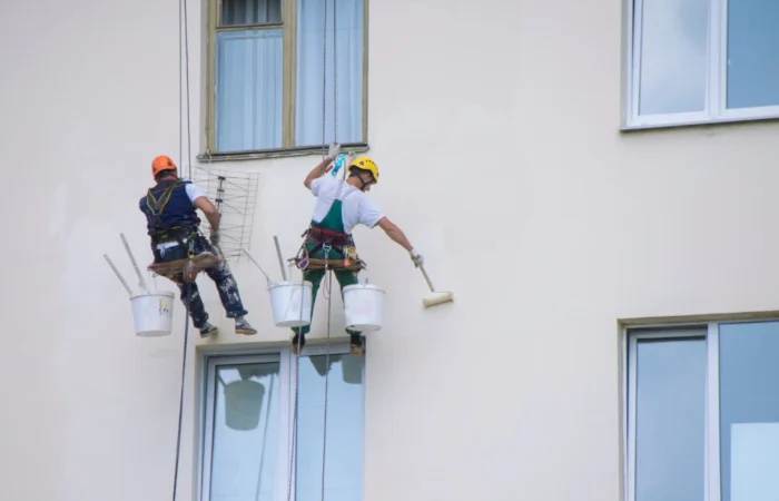
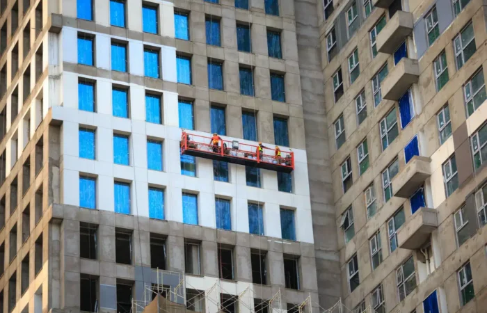
Adding {{itemName}} to cart
Added {{itemName}} to cart